Tuesday, December 10, 2013

Portraits and Self Portraits


Tip #3: Use Both Auto and Manual Focus

   A good practice to get into when you're taking self-portraits is to use a mix of auto and manual focus. First, focus on your stand-in object using auto focus. Then, with the object still in focus, switch your lens to manual focus.
This will give you the freedom to tweak settings, re-meter for changing light and anything else you need to all without screwing up your established point of focus. Just make sure you stand perfectly on your mark each time you take a photo.

Get Closer
   The most common mistake made by photographers is that they are not physically close enough to their subjects. In some cases this means that the center of interest—the subject—is just a speck, too small to have any impact. Even when it is big enough to be decipherable, it usually carries little meaning. Viewers can sense when a subject is small because it was supposed to be and when it's small because the photographer was too shy to get close.
Don't be shy. If you approach people in the right way, they'll usually be happy to have their picture made. It's up to you to break the ice and get them to cooperate. Joke around with them. Tell them why you want to make the picture. Practice with people you know so that you are comfortable; people can sense when you aren't.

   You can also capture a self-portrait by supporting your camera, then frame your picture and focus with a stand-in. 
Environmental Portraits 
I like this photo because theres not much going and its not centered but yet its focuses on one person.
I like this photo because its a self portrait but the child is not paying attention do it makes it simple but pretty.
Casual Portraits
I like this photo because its casual wear and theres really nothing going on they're just posing.

I like this photo because its just somebody (lady) posing for to take a picture and its simple.

Formal Portraits 
I like this photo because Its a formal wear and she is meant to be in a position someone told her to be in. its a serious picture that is being taken.
I like this photo because theres nothing in the background its focused on one thing and its meant for it to be taken as a professional photo.
Self Portraits  
I like this self portrait because its simple and she has taken it herself 
I like this photo because he's taking it with the reflection of the mirror. 


Tiana  and I will be taking each others portraits.


Friday, December 6, 2013

Rules of Photography Part 2

Rules of Thirds:


Balance/Balancing Elements:


Lines/Leading Lines:


Simplicity/ Background:


Framing:


Avoiding Mergers:


Symmetry and patterns (repetition):


Viewpoint:


Create Depth:


Cropping:

Thursday, November 21, 2013

Three Pillars of Photography

Aperture:
F2.8

F16 

1. We should relate to the main thing that is zoomed an not blurry.
2. The smaller the Aperture the bigger the number, the higher the Aperture the smaller the number.
3. Aperture impacts Depth of Fields by focusing on the object that seems more important or sharp.

Shutter Speed:
High Shutter Speed

 Slow Shutter Speed

1. C) The rock climbing wall
2. E) The DJ/MC working at the mingle of the circle
-Manual
-Shutter Priority
-Aperture Priority 

ISO:
ISO 200

ISO 6400

1. ISO is an advantage at a football game because it can take pictures with light that is there and most football games are in the dark and ISO can take a picture with low light.
2. He said to use the lowest ISO to capture and retain the most detail.
3.He said to use the highest ISO when theres not enough light for the camera to capture the photos quickly.

-F4: 1/125

-F5.6: 1/125

-F8: 1/60

-F11: 1/60

-F16: 1/30

-F22: 1/8


Friday, November 15, 2013

Caption writing 5 w's & h

1. Joey Gray kisses Beth Gonzalez on Friday at 2:30 p.m. in Times Square in New York City. Gray excitedly grabbed Gonzalez when the news was announced that the allies had defeated the Nazis, ending World War II.


2. Rosie Salinas sits down on Tuesday on the side of her house in Fort Worth Texas. Salinas was saddened when she found out the depression was not close to ending.


3. David Cruz squats down onto the floor on thursday in Southern Sudan. Cruz has been starved do almost death because he has no food.


4. Ken Jin walks with his behind his back on Saturday in Vietnam. Jin cried while the officer insulted him.


5. Steven Jackson lays in the floor on Monday in Boston Massachusetts.  Jackson terrified slowly tries to get up after the booming while he ran.


Friday, November 8, 2013

Great Black and White Photographers Part 3


Picture #1-  I see 2 girls looking at something interesting.
                   I see the two girls don't care being together .

                   The smell in the air is crisp.
                    I smell food in the air

                    I hear children screaming having fun.
                    I hear cars beeping at the stoplight.

                    I taste the bitter taste in my mouth.
                    I tast all the bad air in my mouth.

                    I feel the hot wind hitting me.
                    I feel my sweat dripping on my skin.


Picture #2-  I see 2 men cleaning the church.
                   I see the sun shining in through the windows that are being cleaned
               
                   I smell the candles burning.
                   I smell The old sent of the church.
                 
                   I hear an echo of the 2 men talking.
                   I hear the foot steps the 2 gentlemen are taking while they move.
                 
                   I taste the dust that flew in my mouth.
                   I taste the smoke the candles are letting go.

                   I feel the cold air coming down on me from the air vent.
                   I feel The emptiness of the church.

I would like to  create a powerpoint to show the photos my photographer took.

Monday, October 21, 2013

Mural Project Preview

1. A theme i can use here at school is fashion everybody here has a unique fashion and the code they wear. Everybody has one thing they wear that describes them and i can include their outfit of the day in my mural.


2. This theme is wroth devoting because everybody is sometimes concerned of todays fashion. everybody wants to know what is out there in tyne world and see what they can wear and not look ridiculous and be the only one wearing it.


3. A advantage of using a phone camera is that you can sometimes use effects but  disadvantage is that they won't always com out to clear even if you try focusing it a couple of times and you can't alway zoom to the point that you need.


4. A advantage of using a SLR camera is that you can focus and zoom on the picture and make it look clear if you want. But the disadvantages are that you can't make the picture lack and white or use other effects on the camera cause they don't come wi the camera.


5. I think we should use a SLR camera because we can just take the pictures and make them look clear and then edit them if they need any on the computer but i think the pictures will look more professional if we take it with the SLR camera than our phone camera.


Africa

My reaction to the powerpoint was that all the pictures were so cute and i was looking at all he details of how their habitat looks like.
This picture shows lion and his mate rubbing their heads tougher. I really liked this picture because you can actually see what is going on in the picture and also i thought it was really cute how they like to be together. 
I think that the rule that is evident is the rue of thirds because the subject which is the lion and his mate are not righting the middle but kind of to the side.
A. The type of camera that is was used to take this picture was a Pentax 6711 with only two fixed lenses.
B. His reasons for taking these pictures was to show the animals simply in the state of being. 
C. His hopes by taking these type of photos is to show the stats of being of the animals before they are no longer existing. 
D. "heartbreakingly beautiful" 

Thursday, October 17, 2013

Academic Shoot Reflection

1. Some challenges I faced were people kept looking at the camera while i was trying to take a picture for a specific rule also my pictures didn't focus sometimes when I was trying to point out a rule.
2. I found my self thinking on focusing my pictures and zooming them also so that the rule was clear.
3. On some pictures the subject is clear but not in all pictures.
4. The things I would do the same are shooting at an angle and moving around so I can get the right picture I want.
5. When I go out for the next prompt I think the easiest rule will be rule of thirds because the main object doest have to be spot cent.
6. The hardest rule to capture will be simplicity.
7. The rule that I'm not clear on is Framing what I can do is ooh at other peoples pictures of framing and see what I can do and try my best to get the pest picture out of it.

Tuesday, October 15, 2013

Academics shoot

Lines
The rule here is lines i took a picture of lines but it doesn't show people interacting in it. this subject is art, this shelf is where they keep their art work. It is sort of clear to people because it shows colors and art uses lots of color. I should take a picture with lines where people are around next the to show the rule and make the subject clearer.
Simplicity
I think i followed the rule well because its a plain background that shows simplicity. These kids wherein the hall talking but they were showing simplicity. They subject isn't clear to people. If I didn't do this right then i should get a clearer background to show simplicity.

Rules of Thirds 
I think i followed the rule pretty good because The main person isn't in the center she is kind of to the side. This subject is spanish 2. I think the subject is clear when people look at this photo because of the words on the wall. if the rule is wrong then i could probably focus more on the main object/ person next time i take the photo.

Balance

I think i followed the rules pretty well because it looks like there is equal about of people on each side of the hall way. The subject is speech i believe where they were doing an activity outside of class. No its not clear to people to what subject is being taught. If i didn't follow the rules i need to make it clearer that its balanced out.

Framing 
I followed the epicure pretty well i framed the paints in between two chairs. This subject is art. It clear to people this photograph was taken in the art room. If i didn't take this picture correct by not following this rule then i should probably try framing with something else.

Avoiding mergers
The rule here is mergers i think i took this picture correct because theres people getting cut off on the sides. This picture was taken in a classroom where learning is happening. It really isn't clear to people what subject it is. I should of taken a picture whereat shows what actual subject is happening next time.


Wednesday, October 2, 2013

Academics Shoot Preview


The Story


This shows young adults handing out food to elderly. I think the students are helping the older people by giving and feeding them.

Action or Emotion 
This shows how amazed the girls are by what just happened with their experiment. 

Fills the Frame
This frame is filled with people around a table felling and watching what is happening to the experiment and how it spreads around the table and touches their hands.


I chose this picture because it shows how focused the student is while mixing the experiment. 
Some rules of photography shown are balance of the photo and the picture is focused on the student and what he is doing nothing else. It shows texture because you can see whats happening in the experiment.

I can take photos like the ones i took today in science classes electives like dance, theatre, and gym.
I would like to visit some science classes, theatre, gym, and maybe band.
I will focus my pictures and take them at an angle to show that they are doing and move in different positions to take the picture and make it come out good.


Monday, September 30, 2013

Elements of Art and Principles of Design in Photography

Elements of Art:
Line: Lines are marks made by a pointed tool: brush, pencil, pen, etc. Lines can vary in width, direction, curvature, length, or color.
I chose this photo because of the clear lines that form of railing.

I chose this painting because of the 2 strong yellow lines that shot out of the painting.

Shape: Shapes are formed wherever the ends of a continuous line meet. Geometric shapes such as circles, triangles or squares have perfect, uniform measurements and don't often appear in nature. Organic shapes are associated with things from the natural world, like plants and animals.
 I chose this photo because of the perfect the metal forms an oval.
I chose this painting because of the shape of the sphere and how it shapes the image.

Color : Color wheels show the primary colors, secondary colors, and the tertiary (intermediate) colors. They also show the relationships between complementary colors across from each other, such as blue and orange; and analogous (similar or related) colors next to each other such as yellow, green, and blue. Black and white may be thought of as colors but, in fact, they are not. White light is the presence of all color; black is the absence of reflected light and therefore the absence of color.
 I chose this photo because of the color it contains and it has all primary and secondary colors.

I chose this painting because its colorful.
Value (Tone): Value, or tone, refers to dark and light; the value scale refers to black and white with all gradations of gray in between. Value contrasts help us to see and understand a two-dimensional work of art.
 I chose this photo because it shows the different shades and where it has to be darker and where its supposed to be lighter.
I chose this painting because it shows the different shades of the cool it shows where its supposed to be lighter and where it should be darker.

Form: Form describes objects that are three-dimensional, having length, width, and height.
 I chose this photo because Its three-dimensional and it shows length, width, and height.
I chose this painting because it makes it seem like they are on a three-dimetional place but in reality its not.

Texture: Texture can be rough, bumpy, slick, scratchy, smooth, silky, soft, prickly--the list is endless. Texture refers to the surface quality, both simulated and actual, of artwork.
 I chose this photo because it shows texture and it looks like its scratchy.
I chose this painting because it looks like the paper that it was drawn on is rough and bumpy.

Space: Space refers to distances or areas around, between, or within components of a piece. Space can be positive (white or light) or negative (black or dark), open or closed,shallow or deep, and two-dimensional or three-dimensional.

I chose this photo because the black and the background gray shows the space that is in the picture.
I chose this pinging because the black in the background shows the space in the painting.


Principles of Design: 

Balance: Balance is the comfortable or pleasing arrangement of things in art. There are three different types of balance: symmetrical, asymmetrical, and radial. The human figure is symmetrically balanced; the same on the left and right side. The tree is asymmetrically balanced; its branches are not distributed equally on each side, but their total weight is balanced left and right. The sun is an example of radial balance; all its rays are equal in length from the center.
I chose this photo because of the balance of the color on both wings of the butterfly and the shape how it balances futon both sides.
I chose this painting because of the balance of people throughout out the picture it balances out the whole painting.

Contrast: Contrast is created by using elements that conflict with one another. Often, contrast is created using complementary colors or extremely light and dark values. Contrast creates interest in a piece and often draws the eye to certain areas. It is used to make a painting look interesting.
 I chose this photo because it shows the contrast of the colors and how they are going in a different direction.
I chose this painting because of the contrast of the colors the difference of the light part of the flower and the dark part of the flower.

Emphasis: Emphasis in the focal area of an artwork gives it importance. An artist may stress some elements of the design over others. The eye of the viewer will focus on the area of emphasis or center of interest first, then take in the rest of the composition
 I III chose this photo because of the the focus on the leaves and it emphasizes the details also.
I chose this painting because it emphasizes the ends of the waves and the details of the water.


Movement: Movement in an artwork means the artist is taking viewers on a trip through the work by means of lines, edges, shapes, and colors often leading to the focal area. Movement is a visual flow through the composition. It can be the suggestion of motion in a design as you move from object to object by way of placement and position. Directional movement can be created with a value pattern. It is with the placement of dark and light areas that you can move your attention through the format.
 I chose this photo because it shows the movement of water in the river.
I I chose this painting because it shows the movement of the water in the ocean.

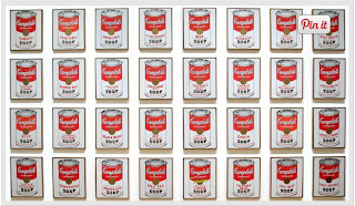
Pattern: Patterns are made in art when the same shapes or elements are repeated again and again. Pattern uses the elements of art in planned or random repetitions to enhance surfaces of paintings or sculptures.
 I chose this photo because it shows the pattern of the zebras stripes.
I chose this painting because it shows the pattern of the cans on the wall.

Rhythm: Rhythm is the repetition of shapes, lines, and forms. Rhythm is a movement in which some elements recurs regularly. Like a dance, it will have a flow of objects that will seem to be like the beat of music.
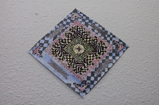
 I chose this photo because of they rhythm of the different shapes.
I chose this photo because of the different shapes int he painting which shows a rhythm.

Unity: Unity means that all elements in an artwork are in harmony. Unity brings together a composition with similar units. For example, if your composition was using wavy lines and organic shapes you would stay with those types of lines and not put in even one geometric shape.
 I chose this photo because of the different type of lines which shows unity.
I chose this painting because of the different set of lines and shapes which shows unity.