Monday, September 30, 2013

Elements of Art and Principles of Design in Photography

Elements of Art:
Line: Lines are marks made by a pointed tool: brush, pencil, pen, etc. Lines can vary in width, direction, curvature, length, or color.
I chose this photo because of the clear lines that form of railing.

I chose this painting because of the 2 strong yellow lines that shot out of the painting.

Shape: Shapes are formed wherever the ends of a continuous line meet. Geometric shapes such as circles, triangles or squares have perfect, uniform measurements and don't often appear in nature. Organic shapes are associated with things from the natural world, like plants and animals.
 I chose this photo because of the perfect the metal forms an oval.
I chose this painting because of the shape of the sphere and how it shapes the image.

Color : Color wheels show the primary colors, secondary colors, and the tertiary (intermediate) colors. They also show the relationships between complementary colors across from each other, such as blue and orange; and analogous (similar or related) colors next to each other such as yellow, green, and blue. Black and white may be thought of as colors but, in fact, they are not. White light is the presence of all color; black is the absence of reflected light and therefore the absence of color.
 I chose this photo because of the color it contains and it has all primary and secondary colors.

I chose this painting because its colorful.
Value (Tone): Value, or tone, refers to dark and light; the value scale refers to black and white with all gradations of gray in between. Value contrasts help us to see and understand a two-dimensional work of art.
 I chose this photo because it shows the different shades and where it has to be darker and where its supposed to be lighter.
I chose this painting because it shows the different shades of the cool it shows where its supposed to be lighter and where it should be darker.

Form: Form describes objects that are three-dimensional, having length, width, and height.
 I chose this photo because Its three-dimensional and it shows length, width, and height.
I chose this painting because it makes it seem like they are on a three-dimetional place but in reality its not.

Texture: Texture can be rough, bumpy, slick, scratchy, smooth, silky, soft, prickly--the list is endless. Texture refers to the surface quality, both simulated and actual, of artwork.
 I chose this photo because it shows texture and it looks like its scratchy.
I chose this painting because it looks like the paper that it was drawn on is rough and bumpy.

Space: Space refers to distances or areas around, between, or within components of a piece. Space can be positive (white or light) or negative (black or dark), open or closed,shallow or deep, and two-dimensional or three-dimensional.

I chose this photo because the black and the background gray shows the space that is in the picture.
I chose this pinging because the black in the background shows the space in the painting.


Principles of Design: 

Balance: Balance is the comfortable or pleasing arrangement of things in art. There are three different types of balance: symmetrical, asymmetrical, and radial. The human figure is symmetrically balanced; the same on the left and right side. The tree is asymmetrically balanced; its branches are not distributed equally on each side, but their total weight is balanced left and right. The sun is an example of radial balance; all its rays are equal in length from the center.
I chose this photo because of the balance of the color on both wings of the butterfly and the shape how it balances futon both sides.
I chose this painting because of the balance of people throughout out the picture it balances out the whole painting.

Contrast: Contrast is created by using elements that conflict with one another. Often, contrast is created using complementary colors or extremely light and dark values. Contrast creates interest in a piece and often draws the eye to certain areas. It is used to make a painting look interesting.
 I chose this photo because it shows the contrast of the colors and how they are going in a different direction.
I chose this painting because of the contrast of the colors the difference of the light part of the flower and the dark part of the flower.

Emphasis: Emphasis in the focal area of an artwork gives it importance. An artist may stress some elements of the design over others. The eye of the viewer will focus on the area of emphasis or center of interest first, then take in the rest of the composition
 I III chose this photo because of the the focus on the leaves and it emphasizes the details also.
I chose this painting because it emphasizes the ends of the waves and the details of the water.


Movement: Movement in an artwork means the artist is taking viewers on a trip through the work by means of lines, edges, shapes, and colors often leading to the focal area. Movement is a visual flow through the composition. It can be the suggestion of motion in a design as you move from object to object by way of placement and position. Directional movement can be created with a value pattern. It is with the placement of dark and light areas that you can move your attention through the format.
 I chose this photo because it shows the movement of water in the river.
I I chose this painting because it shows the movement of the water in the ocean.

Pattern: Patterns are made in art when the same shapes or elements are repeated again and again. Pattern uses the elements of art in planned or random repetitions to enhance surfaces of paintings or sculptures.
 I chose this photo because it shows the pattern of the zebras stripes.
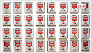
I chose this painting because it shows the pattern of the cans on the wall.

Rhythm: Rhythm is the repetition of shapes, lines, and forms. Rhythm is a movement in which some elements recurs regularly. Like a dance, it will have a flow of objects that will seem to be like the beat of music.
 I chose this photo because of they rhythm of the different shapes.
I chose this photo because of the different shapes int he painting which shows a rhythm.

Unity: Unity means that all elements in an artwork are in harmony. Unity brings together a composition with similar units. For example, if your composition was using wavy lines and organic shapes you would stay with those types of lines and not put in even one geometric shape.
 I chose this photo because of the different type of lines which shows unity.
I chose this painting because of the different set of lines and shapes which shows unity.


Mergers

In this photo their is no merge because theres people that got cut off the picture.

Framing

In this photo the smoke on top frames the picture of the tower collapsing.

Thursday, September 26, 2013

Balance

In this photo the twin towers shows the balance of this picture because you can see both of them and they are even.

lines

In this photo the pole shows the line with makes the flag stand out.

The rules of thirds

In this photo the lady in green forms the rule of thirds because if the lines were there she would be in the intersection. 

Simplicity


In this photo the blue sky shows the simplicity of the photo because it has a plane blue background.

Friday, September 20, 2013

Photo Manipulation and Ethics

This type of photo is unethical because its just lying to the public and fooling everybody and hiding the truth. Many unethical photos are out in the public with lies in the articles for years but usually they do find who published the photos. None of the photos that get edited like is are acceptable in any case because many people actually do believe the stories while The truth is hidden be hid another photo. Many people do end up finding out the truth behind these fake photos. 


This pictures is unethical because many people were cropped  out and also the effect was changed. This is the worst of all three pictures because you can see the difference.

This picture is unethical because you can see the editing is darker, but its not as bad as the others. This Picture looks like the original one but the color is darker then the original one its still not acceptable because they took credit from somebody else's job.

40 Great Photos Ever

Photographer: Aaron Thompson
 What made me pic this photo was because it showed how a soldier was handing a little boy the american flag. The composition made me gravitate to the photo because the flag was handed to the child during a memorial for his father. This photo made the cut to the top 40 photos ever because of what was happening in the photo and how the moment was caught on camera.
Getty Images
What made me pick this photo was that the lady was the only one against the car crying from the composition my eye gravitated how it said it was 6 fallen soldiers and her cousin. This photo made the cut for the top 40 photos because it caught the eye of someone that there is only one lady on one of the car.
Louie Favorite 
What made me pick this photo was that a lady is hugging a little and she is crying. What in the composition that gravitated my eye was that Terri was reunited with her daughter after being in Iraq for 7 months. This photo made the cut for the top 40 photos because it just shows a special moment of someones and especially from someone that has served for our country and comes back after 7 months to visit her child.

Wednesday, September 18, 2013

Post Shoot Reflection

Isaac Mercado 
http://isaacphotojournalismblog.blogspot.com/
Positive:
1. On the red photo its very focused.
2. All three pictured are clear.
Negative:
1. On metal should of been farther to show more of the metal.


Great black and white photographers, PART 2

Gordon Park
Birth:  November 30, 1912
Death: March 07, 2006
Place of Birth: Fort Scott, Kansas
Education: after viewing some photographs of migrant workers it encouraged him to move to a bigger city and began to explore portraits and fashion photographers in Chicago.
Job: Photographer, musician, writer and film director.
Famous works published:

National Geographic Warm-up


This is my favorite photo because its focused on a specific thing but yet it shows other things around it. I like the effect of black and white. I like how it shows details in the picture. 
I would take a picture of nature to show the world that surrounds me, and enter that photo to the contest. 

Thursday, September 12, 2013

Camera parts 2

1. Display button: It shows the picture on the screen.
2. Erase button: Deletes the button.
3. Setting button: shows the settings of the camera.
4. Playback button: Shows the previous pictures.
5. The live view shooting button: Is when it shows the picture on the screen while taking the photo.

Tuesday, September 10, 2013

Camera Parts

Aperture: An opening, hole, or gap.

Shutter: A device that opens and closes to expose the film in a camera.

Exposure: The quantity of light or other radiation reaching a photographic film as determined by shutter speed and lens aperture.

Depth of field: The distance between the nearest and the furthest object that give an image judged to be in focused in a camera.

Focal length: The distance between the center of a lens or curved mirror and its focus.


Camera History

"The Camera"
1. The camera obscura effect is achieved by when a tiny whole is created in one wall and through the hole light is focused and the outside scene is projected on the opposite wall.
2. In the 17th century Isaac Newton and Christian Huygens perfected the understanding of the optics and also the process of making high quality glass lenses which made them get closer to creating the modern camera.
3. The parts of the first modern camera invented by Niepce were a glass lens, a dark box, and film.
4. Modern digital cameras and niepce's camera have a lens, and film.
5. A digital camera use an electronic sensor called a CCD to capture an image.

"Camera Modes"
6. The difference between the Auto Mode and the Program Mode is that you can actually control flash and few other things on Program Mode not like Auto Mode you can't con toll anything it controls by itself.
7. To attempt to blur out the background, camera will try to use to fastest available lens setting (aperture)
8.The sports mode is used to freeze motion, camera will use the highest shutter speed possible.

"The Half Press."
9. You should do a half press on the trigger button because it will lead to faster camera response time, more control over focus, encourages better composition.

"Controlling flash."
10. This symbol means No Flash.
11. This symbol means Auto-flash

"Introduction to exposure."
12.  The picture will be washed-out if theres is too much light.
13. The picture will be dark if theres not enough light .

"The Universal Stop."
14.  A "stop" is a relative measurement of light.
15.  It is 1 spot brighter in the new planet if there are two suns instead of one.
16.  It is 2 spots brighter in the new planet if there are two suns instead of one.

"Shutters and Aperture."
17. The longer shutter speed the more light there will be.
18. The shorter shutter speed the less light there will be.
19.  The aperture controls the opening known as the F-Spot.
20. The larger the opening the more light will come in.

Wednesday, September 4, 2013

Best and Worst


I liked this photo because it looks clear. I stood some what in front of her and focused the picture and took it. I picked this photo because its the most clear photo I took. I picked this photo because it the best photo I took and its focused with makes me like this photo.
I don't like this photo because its not as clear and I can't really look at her face. I don't like how its sort of blurry! I picked this photo as my worst because i don't like how it cam out and even at the angle and plus I didn't focus it so it could come out clear.